Your cart is empty
You may check out all the available products and buy some in the shop
Return to shop
is an international digital design agency based in The Netherlands & The Philippines, creating the future of tomorrow yesterday.
My work ranges from building complete digital experiences to hands-on CRO, experimentation and continuous customer journey optimization.
These selected cases show different parts of that work: from transforming an e-commerce experience and building an internal creative capability at fonQ to structured CRO and experimentation within Viking Direct / Office Depot.
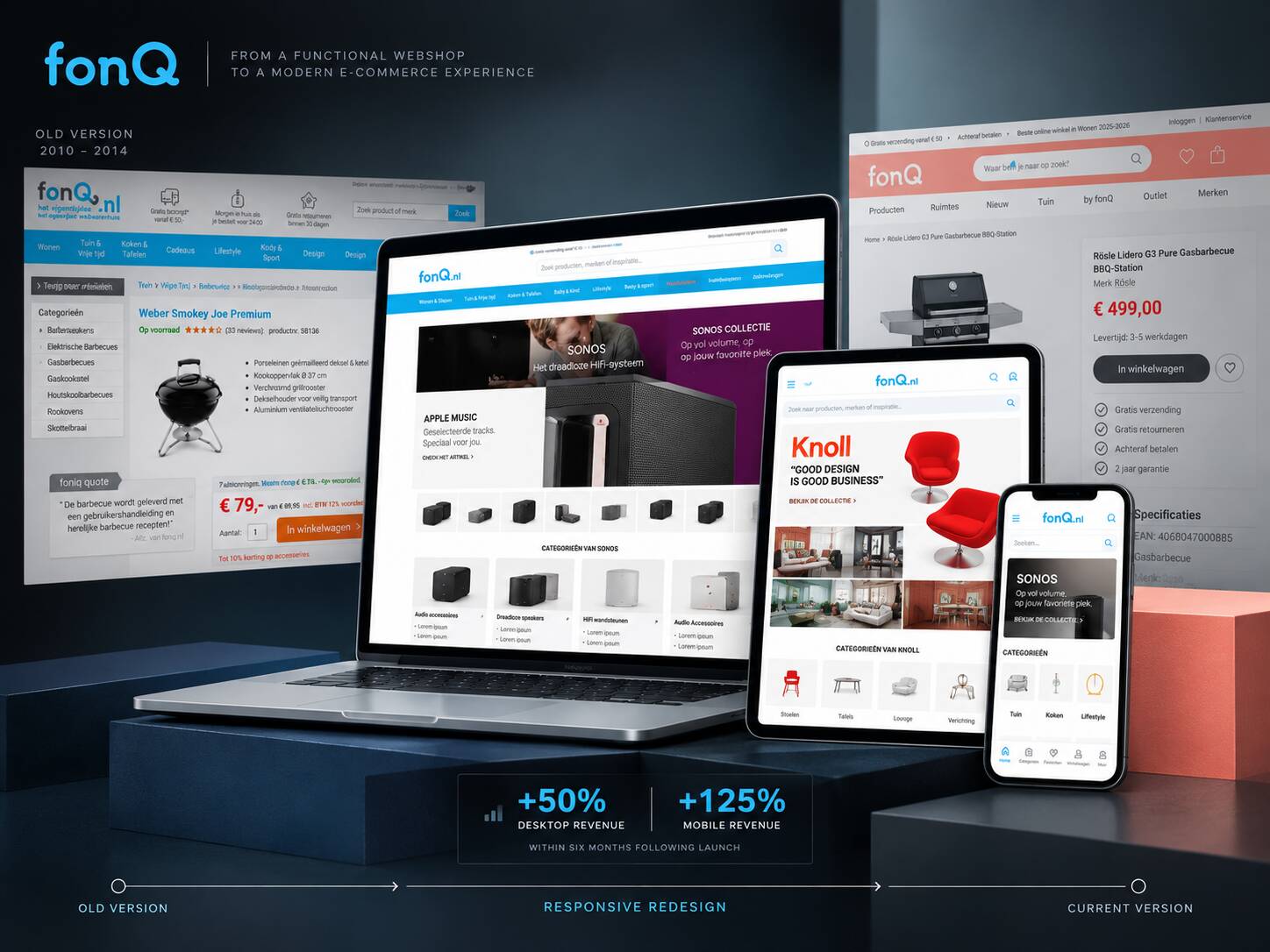
Building an internal creative capability, creating a more consistent digital design direction and helping transform fonQ into a responsive e-commerce experience.
I joined fonQ when there was no established internal creative and UX team. Part of my role was to build that capability, create more consistency across digital and commercial touchpoints and help shape a new responsive webshop together with an external UX specialist.
The work expanded far beyond a visual refresh. It included team building, digital art direction, brand consistency, campaign and email design, photography, inspiration content and the redesign of core e-commerce templates.
Within six months following launch, fonQ recorded approximately +50% desktop revenue and +125% mobile revenue.
These figures describe business performance following the launch and should not be interpreted as revenue caused solely by the redesign.
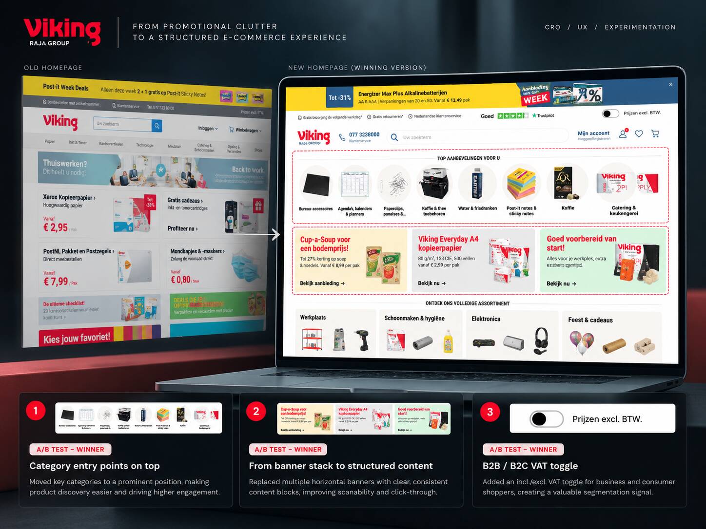
Using CRO, UX and experimentation to rethink the homepage while balancing customer experience, product discovery and commercial requirements.
At Viking Direct / Office Depot I worked as a dedicated CRO specialist, combining behavioral research, UX analysis, experimentation and hands-on optimization across the e-commerce journey.
One major focus was the homepage. The existing version was heavily promotion-led, with many stacked banners competing for attention. Rather than simply removing commercial content, we used experimentation to restructure the page around stronger product discovery and clearer hierarchy.
Key category entry points were introduced prominently on the homepage, promotional banner stacks were replaced with clearer structured content blocks, and a B2B/B2C VAT toggle created a more useful pricing context and future segmentation signal.
Commercially valuable retail-media positions such as the Diamond and Gold placements were intentionally retained. The goal was not to remove advertising, but to reduce promotional clutter while preserving inventory that generated engagement and supplier revenue.
fonQ and Viking required very different types of work.
The challenge involved building capability, creating consistency and establishing a new responsive e-commerce foundation.
The solution required creative leadership, UX, design, e-commerce thinking and later collaboration with CRO and customer experience specialists.
The challenge was not a complete redesign but the systematic improvement of an existing high-traffic e-commerce experience.
Research, experimentation and UX were used to validate changes and improve the journey without ignoring existing commercial realities.
Understand what is holding the experience back, develop the right response and use evidence to determine what deserves to move forward.
I currently develop and run approximately 10–15 conversion experiments per month across different websites, customer journeys and e-commerce environments.
At that pace, roughly 150–200 experiments can pass through my workflow in a year. Repetition creates something individual case studies cannot: the ability to recognize recurring customer problems, interaction patterns and optimization opportunities that repeatedly deserve investigation.
That experience gives me a head start when entering a new business. I rarely begin with an empty sheet. I already know where friction commonly occurs and which questions are worth investigating first.
Different audiences, products, propositions and levels of intent behave differently. I do not copy a winning idea from one client to another and assume it will work. Research establishes the context. Experimentation establishes whether the idea works for that audience.
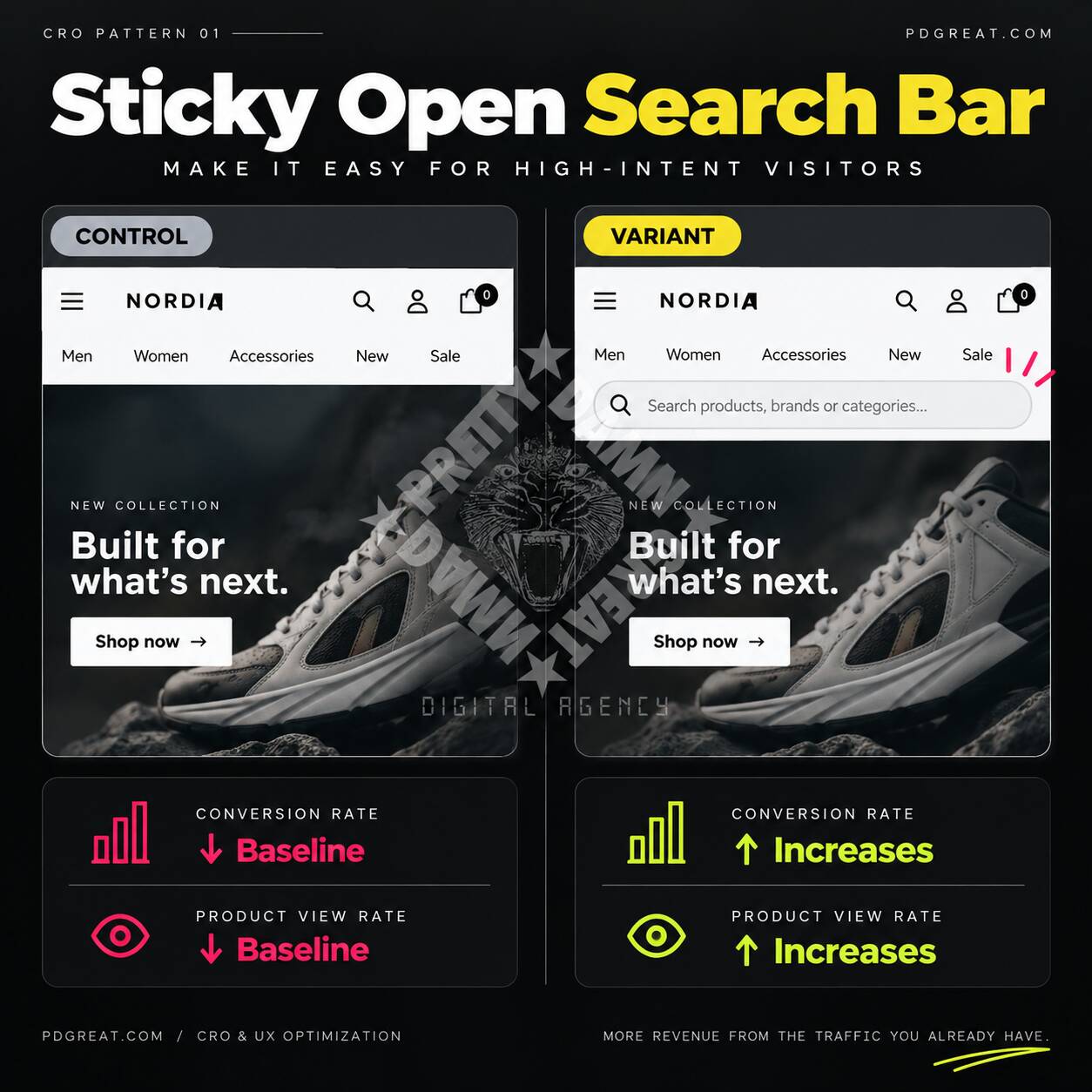
Site search becomes particularly valuable when visitors already have a product, brand, category or problem in mind. Yet on many e-commerce websites search is reduced to an icon that first needs to be found and opened.
A recurring experiment I use is exposing search directly in the interface, particularly on mobile. Removing that interaction can give high-intent visitors an immediate route toward the products they are already trying to find.
If search is immediately visible and accessible, visitors with existing intent can start product discovery with less friction, potentially increasing search usage, product discovery and downstream conversion.
Why I still test it: prominent search is not automatically better for every store. Its value depends on search quality, catalogue complexity, visitor intent and how customers prefer to navigate.
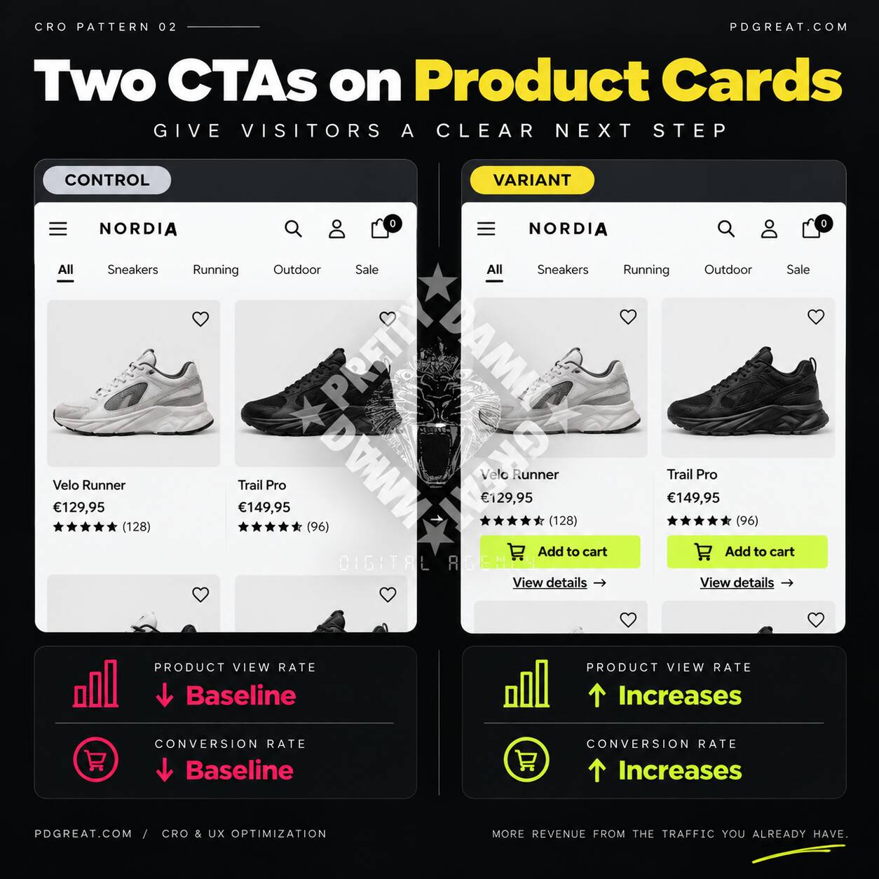
Product cards are often treated primarily as information containers: image, title, price and perhaps reviews. But visitors still need to understand what they can do next.
One recurring optimization pattern is making those actions explicit. Depending on the product and buying journey, this can mean offering both a direct purchase action and a clear route to the product detail page.
By making both purchase and product-detail actions explicit, visitors who are ready to buy can act immediately while visitors who require more information retain a clear path toward deeper consideration.
The important distinction: adding more buttons is not the objective. The experiment is about matching available actions to different levels of purchase readiness without creating additional cognitive load.
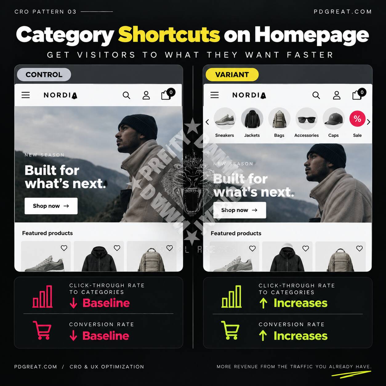
A homepage does not only need to communicate the brand. For returning or high-intent visitors it can also function as a shortcut into the product catalogue.
Exposing important categories visually near the top of the homepage is a pattern I have repeatedly explored. Instead of requiring visitors to open a menu and interpret its navigation structure, useful destinations become immediately visible.
If popular or commercially important categories are available as direct visual shortcuts, visitors can reach relevant product ranges faster, potentially improving category discovery and progression through the shopping journey.
Which categories deserve that visibility should come from customer behaviour, commercial priorities and research, not simply from what looks good in the interface.
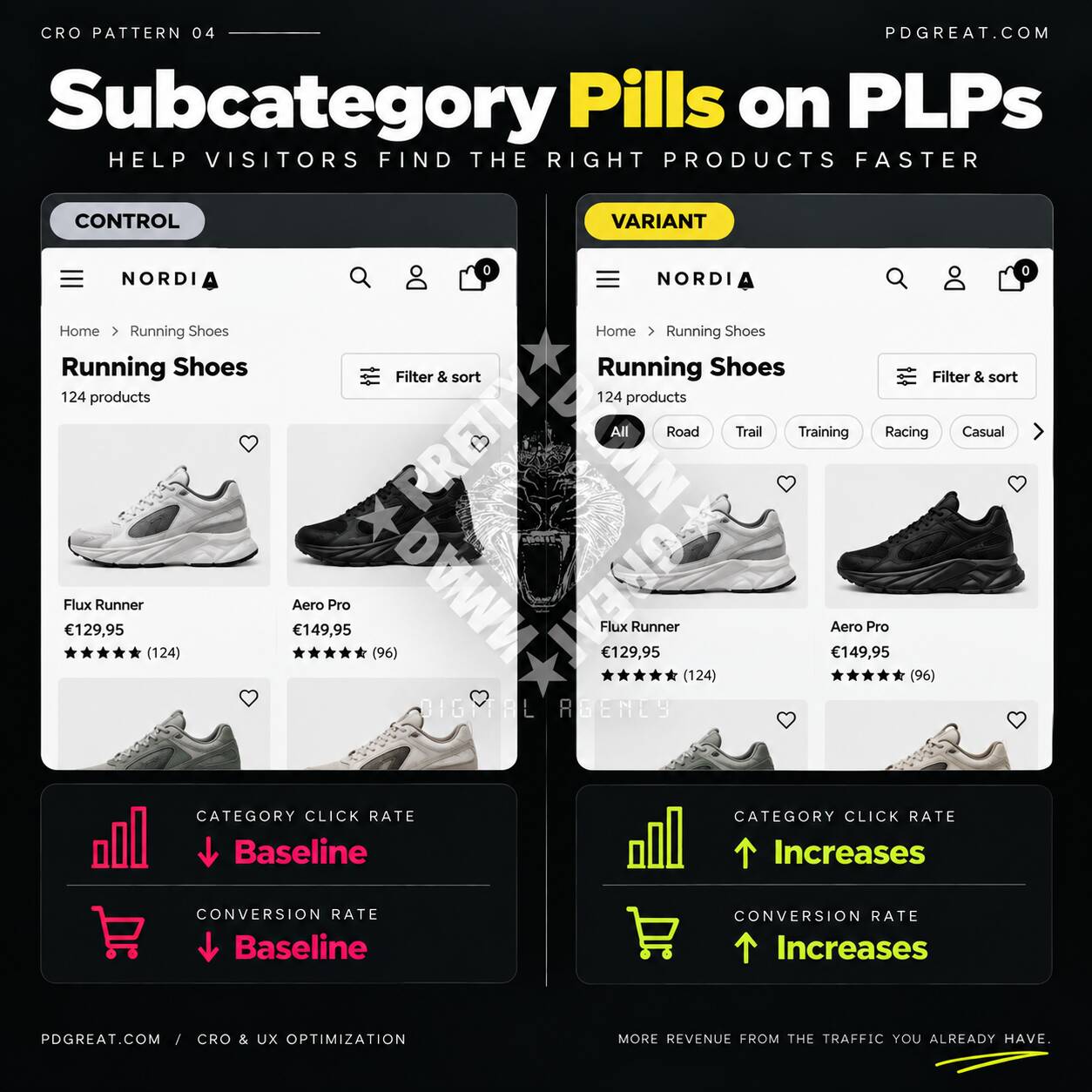
Visitors arriving on a broad product listing page may still face hundreds of products. Traditional filters can solve this, but they are often hidden behind a filter panel, especially on mobile.
A recurring pattern is exposing a small number of useful subcategories or high-value refinements directly above the product grid. This creates a lightweight intermediate step between category navigation and detailed filtering.
If the most useful refinements are visible before visitors open the full filter interface, they can narrow a large assortment faster and reach relevant products with fewer interactions.
The interface pattern may transfer between stores, but the categories should not. Which shortcuts deserve exposure should be informed by the assortment and actual customer behaviour.
Experience helps me recognize where an opportunity may exist. Research and experimentation determine how that opportunity should be translated for a specific audience.
The examples below illustrate that difference. The underlying principle may be familiar, but the execution is shaped around the actual interface, customer journey and behaviour rather than copied from another website.
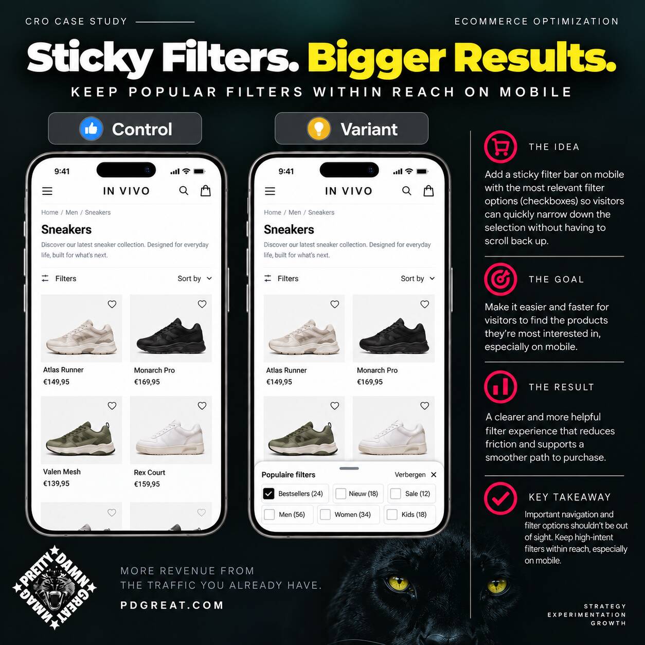
On long mobile product listing pages, useful filtering controls can disappear as soon as visitors start exploring the assortment. Returning to the top or repeatedly reopening a large filter interface adds friction at exactly the moment someone is trying to narrow their choice.
One solution is a sticky filter layer containing a deliberately limited set of popular or high-value filters. In this concept the controls remain available while browsing and use checkboxes so multiple criteria can be combined.
Do not make important navigation disappear simply because the visitor has started using the page. Keep the next useful action available at the moment it becomes relevant.
Which filters qualify as popular should be determined from catalogue structure, filter usage and customer behaviour rather than hard-coded as a universal best practice.
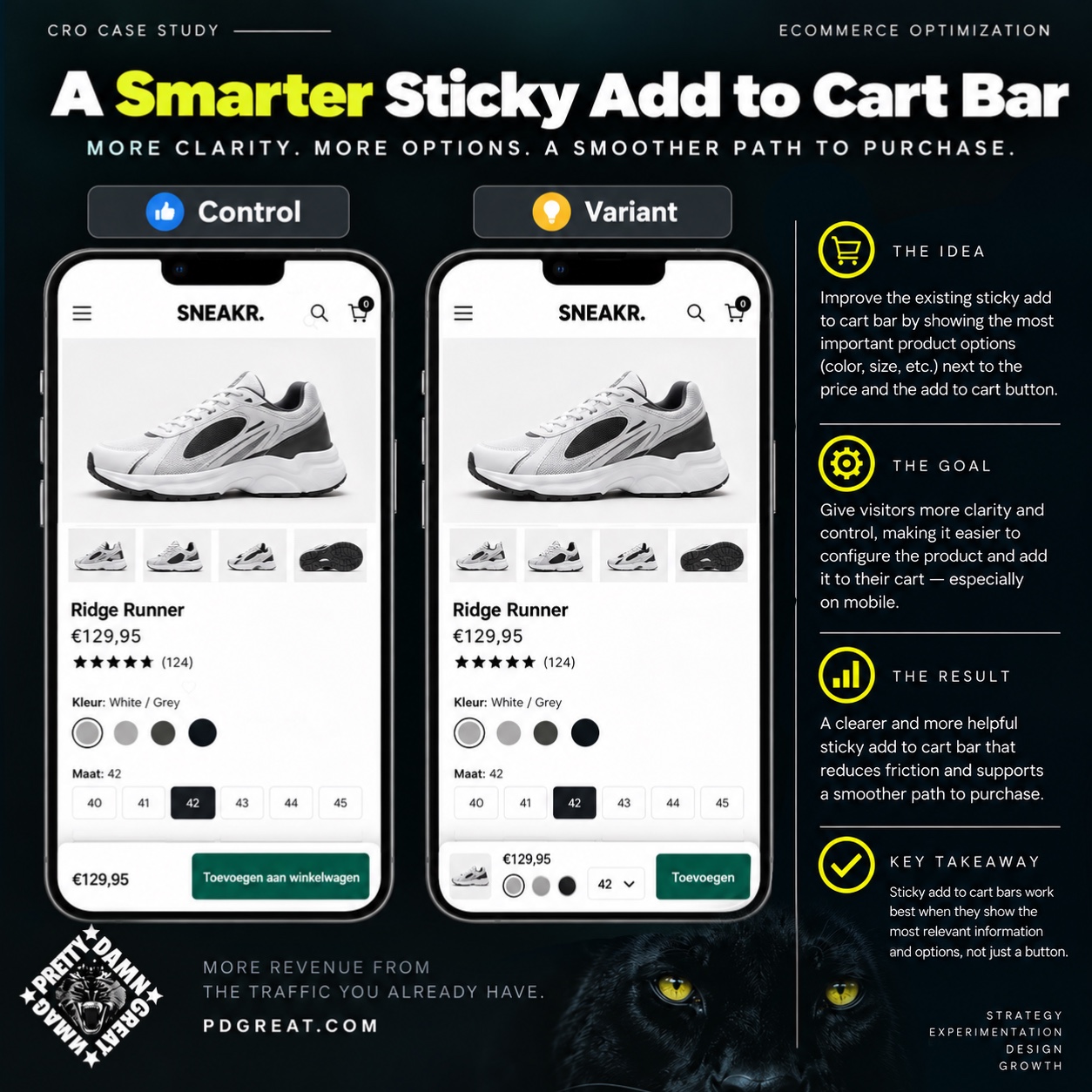
Sticky add-to-cart bars solve an important mobile problem by keeping the purchase action available as visitors move through a product page. But visibility alone does not always remove the remaining purchase friction.
When a product requires choices such as size, colour or another important configuration, those decisions can also be brought into the sticky purchase interface. The visitor can retain product context, price, selected options and the purchase action without navigating back to the original form.
Persistent CTAs can become more useful when the information and decisions required to complete the action remain persistent too.
Context matters: a simple product may only need price and Add to Cart. Products with required variants may benefit from exposing those choices directly in the sticky interface. More information is only useful when it removes a real purchase barrier.
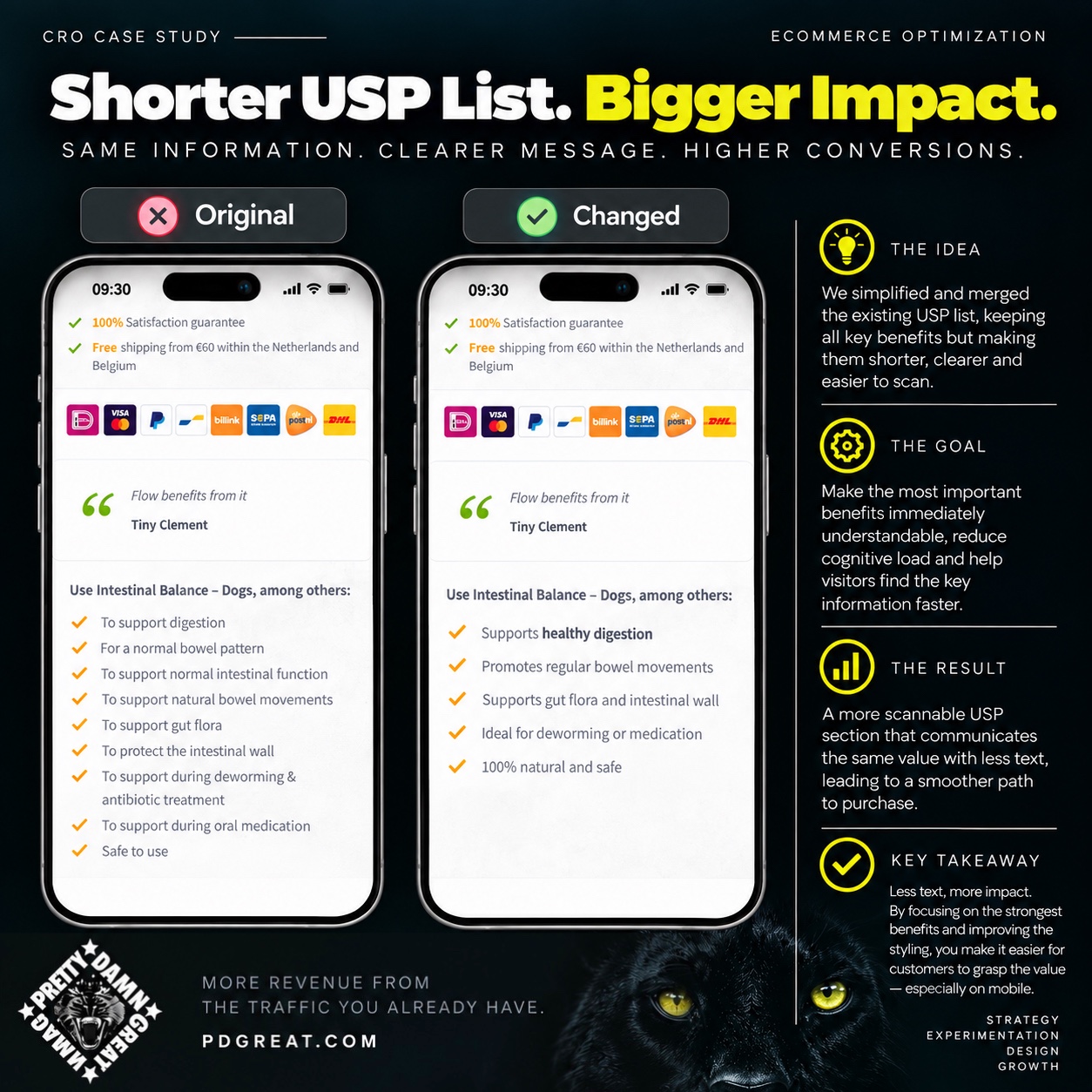
Product pages often accumulate selling points over time. Each individual statement may be relevant, but together they can create repetition, dilute the strongest benefits and make the section harder to scan.
A recurring content optimization technique is to merge overlapping arguments, remove weaker repetitions and improve visual hierarchy so the strongest customer benefits become easier to understand.
If the same core value can be communicated with fewer, stronger and more scannable statements, visitors can understand the proposition faster and continue toward purchase with less cognitive effort.
Shorter is not automatically better. Research and previous experiments can also show that detailed information is essential to a purchase decision. The objective is not to remove content. It is to remove content that does not earn the attention it requires.
Running experiments continuously creates a growing library of patterns, failures, surprises and customer behaviour that I can bring into every new engagement.
That experience means I rarely start with an empty sheet. I can recognize common friction around search, navigation, product discovery, filtering, product information, persuasion, calls to action, checkout and lead generation.
But previous winners are inputs, not answers. I first need to understand the business, audience and journey. An initial CRO audit can reveal obvious friction and measurement issues, while the first experiments start teaching me how that specific audience actually responds.
Those results change what comes next. Winning experiments reveal behaviour worth exploring further. Losing experiments challenge assumptions. Inconclusive experiments tell us where the evidence is still weak.
The longer I work with an organization, the less optimization needs to depend on generic best practices and the more it can be shaped around what its own customers have demonstrated.
Research
↓
Identify friction
↓
Apply experience
↓
Form a hypothesis
↓
Experiment
↓
Learn
↓
Personalize the next idea
That is why PrettyDamnGreat combines CRO research, UX and customer journey analysis with continuous experimentation rather than treating conversion optimization as a checklist of supposedly universal fixes.
I work with businesses and agencies on conversion optimization, experimentation, customer journey improvement and broader digital optimization.
The right solution may be an experiment, a CRO audit, a redesign or a broader optimization program. The starting point is understanding the problem and the potential impact.
The Challenge:
In a highly competitive streaming landscape, the task was to design and launch Viddigo, a new app aimed at redefining user engagement and driving global conversions. The challenge? Start from scratch and create a platform that combines intuitive UX/UI, powerful branding, and seamless streaming experiences while differentiating Viddigo in a saturated market.
The Result:


The Challenge:
Munfarid, a luxury watch dealer in Saudi Arabia specializing in vintage timepieces like Rolex and Cartier, needed a logo that reflected the timeless elegance and craftsmanship of its collection. The objective? Design a logo that exudes sophistication and authenticity, while paying homage to the rich history of vintage watchmaking.
The Result: